Still Wakes the Deep doesn’t feel like how we expect games to feel. Fresh from seeing brand new gameplay during the Xbox Partner Preview show, this game is somehow simultaneously a panicky horror experience, a ‘70s period piece, a deeply British, deeply personal character study, and perhaps even an oil rig explorer. It’s increasingly rare to see a game that simply doesn’t feel like it’s drawing on the same pool of inspirations as the rest of the medium.
That’s why I asked the developers at The Chinese Room to put together a list of the various inspirations they had coming into this project – the results are a “reading list” of movies, TV shows, books, and more that help piece together this incredibly unexpected game. On this list alone, you’ll never have played anything quite like this…
The premise is inspired by… The Thing
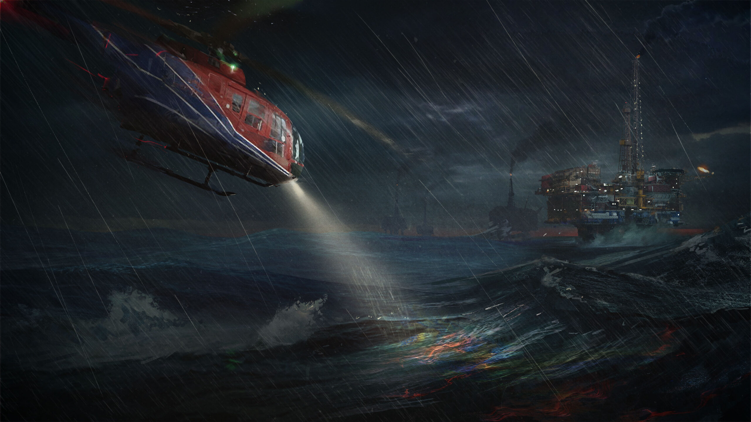
Our project elevator pitch was: ‘”The Thing” on an oil rig’. This short phrase, uttered in a few seconds, touched off a spark in those who heard it, instantly getting them creatively excited in the game. John Carpenter’s 1982 film “The Thing”, and its predecessor novella “Who Goes There?” by John W Campbell, are touchstones for the overall atmosphere of Still Wakes the Deep. A group of professionals, cut off and alone, and facing what feels like an undefeatable enemy, creates just the sort of character drama needed to support the velocity of our story. Paranoia, fear, isolation, and brutal destruction of the human crew are our backdrop. – Lead designer Rob McLachlan (He/Him/His)
The atmosphere is inspired by… Rosemary’s Baby
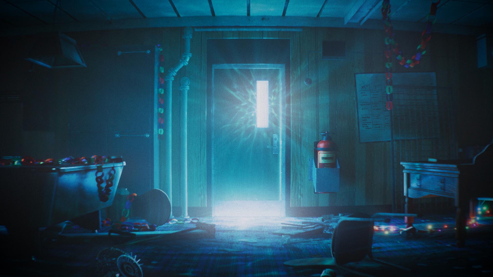
There is something about some ’70s media that feels inherently wrong, as if the artefact itself is cursed. Every frame of “Don’t Look Now” and “Rosemary’s Baby” is imbued with a sense of dread. Domestic or innocuous scenes in which nothing overtly frightening is happening become all the more unsettling, as if something is lurking just under the surface. As well as the period aesthetic, these films have influenced Still Wakes the Deep in how we have explored reoccurring imagery and motifs to unnerve the player. – Associate art director Laura Dodds (She/Her/Hers)
The authenticity is inspired by… Kes
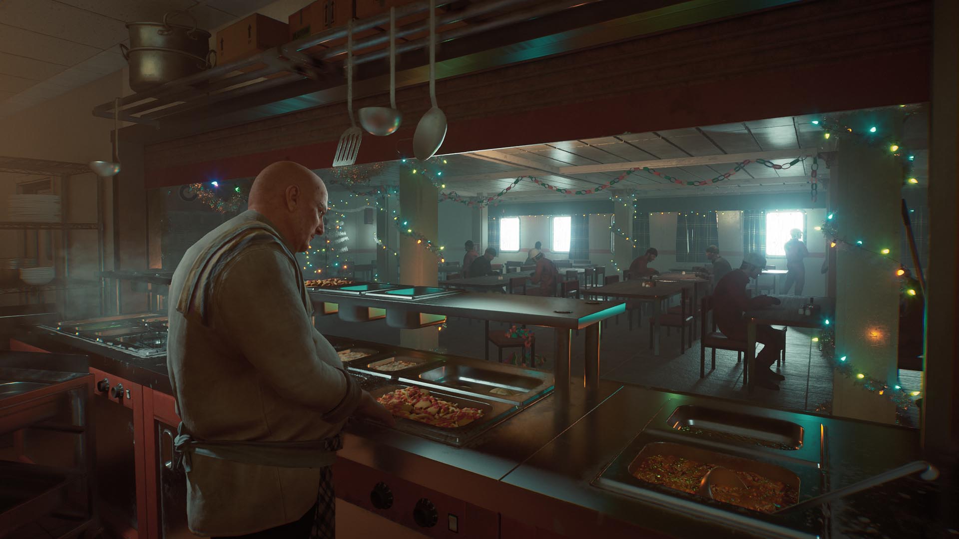
Ken Loach’s early film work had an almost documentary style that grounded its story and characters in a way that felt startlingly realistic to the audience of the time. This shooting style and the naturalistic performances (in local dialect and language) broke down the walls between the world and the viewer so that we could better empathize with the protagonist. This is something we’ve tried hard to incorporate into the game experience. To bring a humanity to it by grounding the player in an authentic world, filled with real people living real lives. – Creative director John McCormack (He/Him/His)
The game structure is inspired by… The Poseidon Adventure
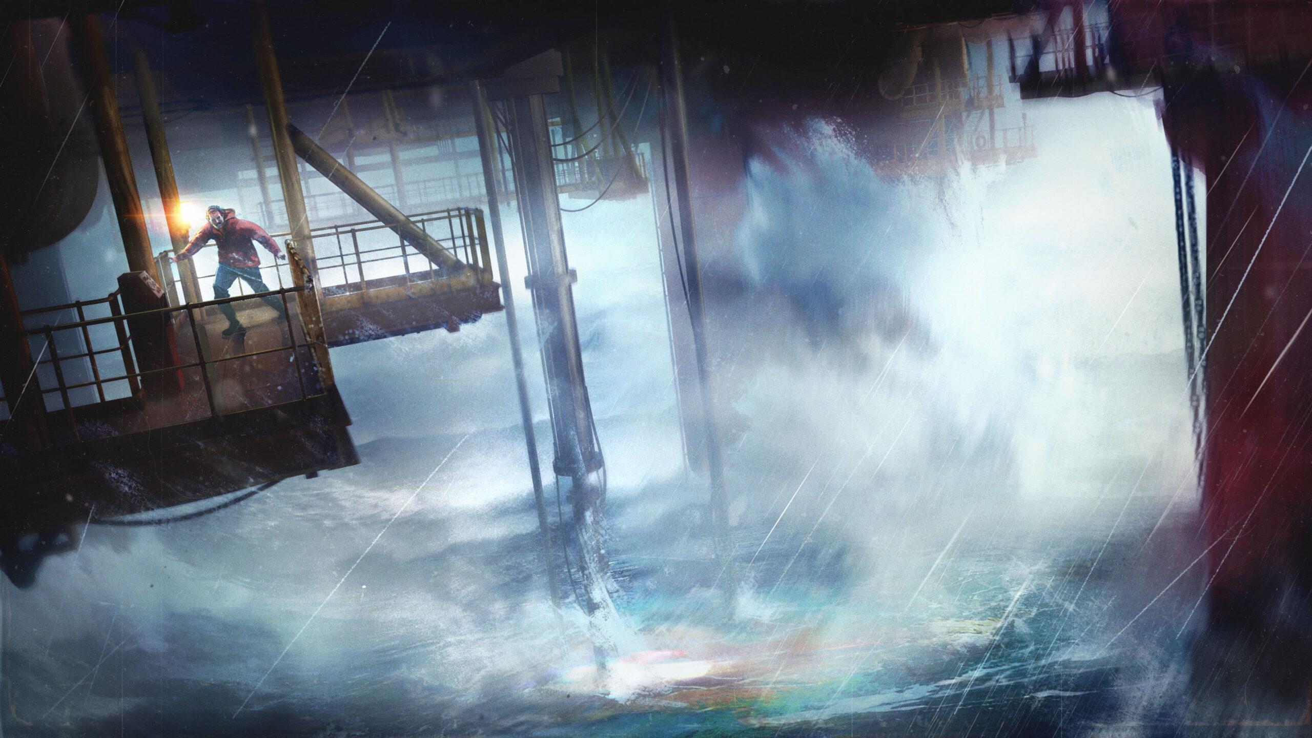
From the beginning of the project our creative direction had us consider a second enemy: the North Sea. We want our players to fear the waves, and to feel trapped above the cold dark water as it floods the rig. The 1972 film “The Poseidon Adventure”, created by the ‘Master of Disaster’ Irwin Allen informed both our dramatic structure and the intensity of our gameplay. The ominous lead up – where the viewer knows something is going to happen, but the characters don’t – is a great bit of narrative tension to keep our players engaged. Gene Hackman’s Reverend, swimming and swinging through the upturned environments of the SS Poseidon, is a perfect archetype for our unathletic hero, Cameron McLeary. – Lead designer Rob McLachlan (He/Him/His)
The beauty and transformation in horror is inspired by… Annihilation
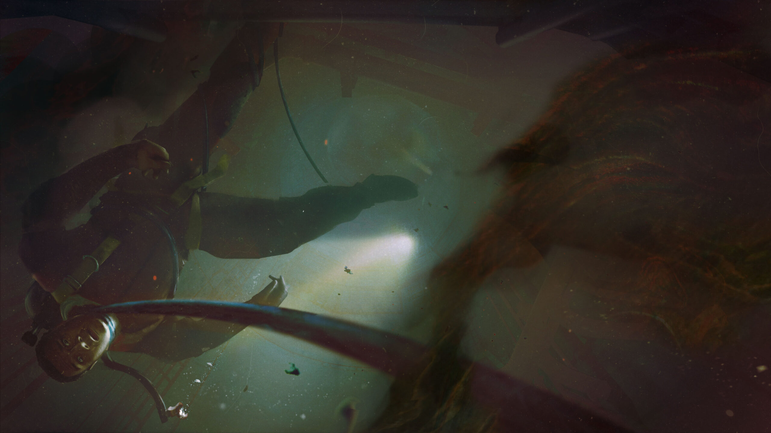
One of our development pillars was ‘a terrible beauty’. We looked at media which managed to capture this dichotomy between disgust and captivation. A common thread between very different visuals – the rainbow shimmer of “Annihilation”, the burst of florals and bright colours in “Midsommar”, and the sumptuously staged dioramas from “Hannibal” – was the theme of transformation. Body horror was often tempered by this theme, whether by human artistry (sculpture, display) or through motifs of growth and life we find beautiful in nature. – Associate art director Laura Dodds (She/Her/Hers)
The audio is inspired by… The Southern Reach Trilogy & the natural world
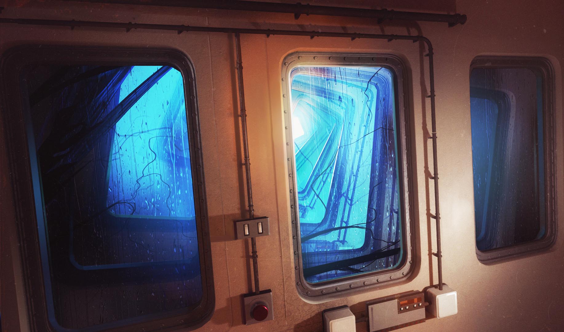
Jeff Vandermeer’s vivid descriptions of a supernatural event that has twisted nature were highly inspiring to the game’s audio direction. He sometimes describes literal sounds, such as when he writes about an ‘essentially indescribable’ creature and “the sound that it made, as if the wind and the sea had been smashed together, and in the aftershock there reverberated that same sonorous moan.”
We also took a lot of direct inspiration from nature. For instance, the sounds that elephants make, which can vocally express a huge range of emotions, and somehow be simultaneously endearing and terrifying. Or how synchronicity ultimately establishes itself in nature after a chaotic event, such as planets orbiting after the big bang – this concept has driven some of our audio systems. The same goes for how sounds in nature don’t tend to happen in isolation: a contact call will elicit a response, an event will trigger a warning; this drove the way we thought about and implemented our ambient audio. In summary, even though we are on an oil rig, isolated and alone, we always considered this humongous metallic man-made structure as a living, breathing entity. Audio director Daan Hendriks
The darkness of the ’70s was inspired by… Sapphire & Steel
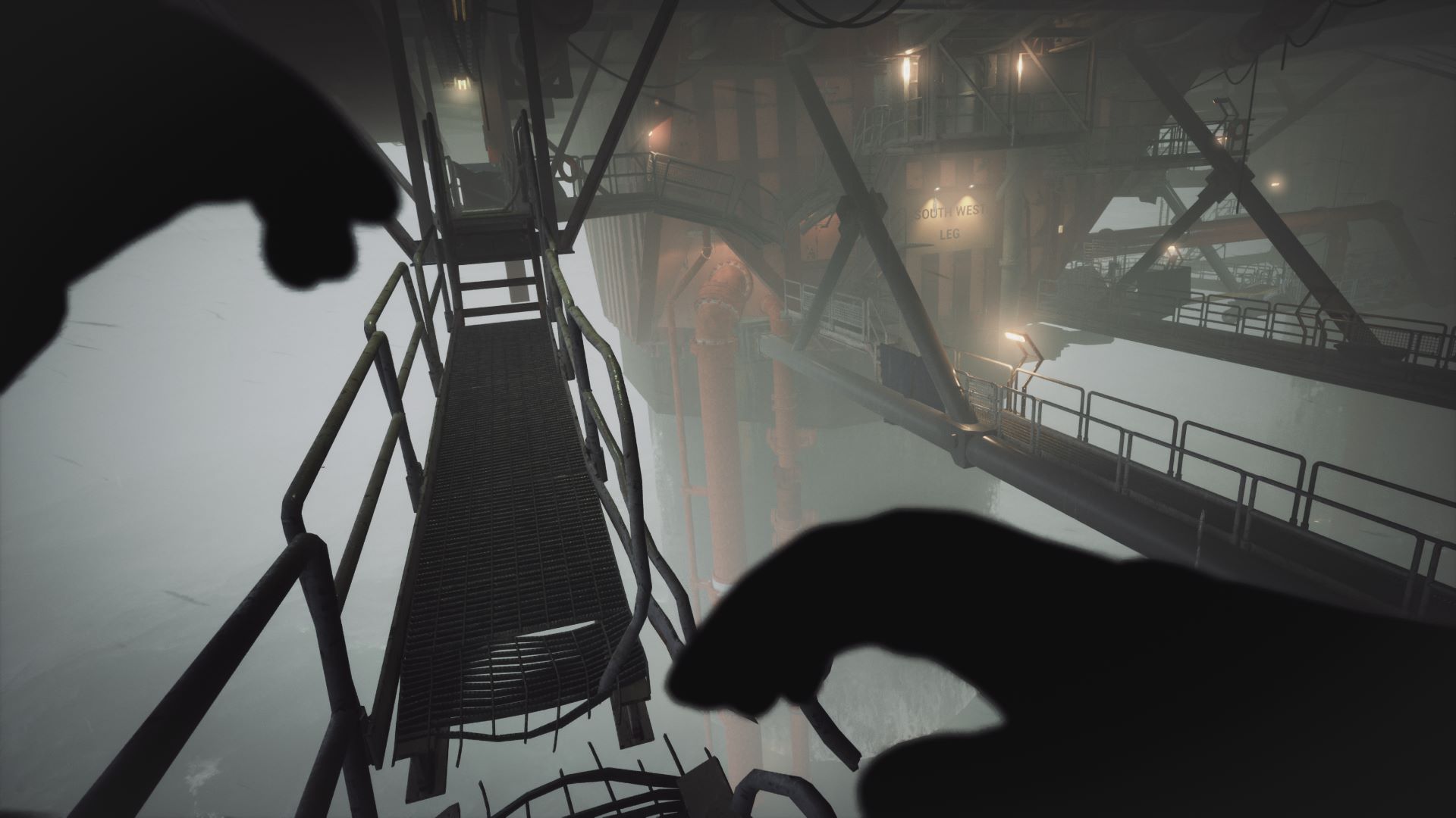
There was something about the science fiction that Britain was producing in the ’60s and ’70s that made it stand out. There was an in-built, oppressive darkness running through each show from “Doctor Who” to “Doomwatch” that left a permanent mark on the viewer. None more so than “Sapphire and Steel”, which was both impenetrably baffling and unnervingly hypnotic to experience at the time. The ‘alien forces’ being battled in the show felt more like cosmic ghosts that haunted the surreal, liminal world with a creeping dread that seemed impossible to grasp. There’s an aspect of this that we’ve tried to bring into our antagonistic force on the rig. Creative director John McCormack (He/Him/His)
The sense of reality unravelling is inspired by… Suspiria
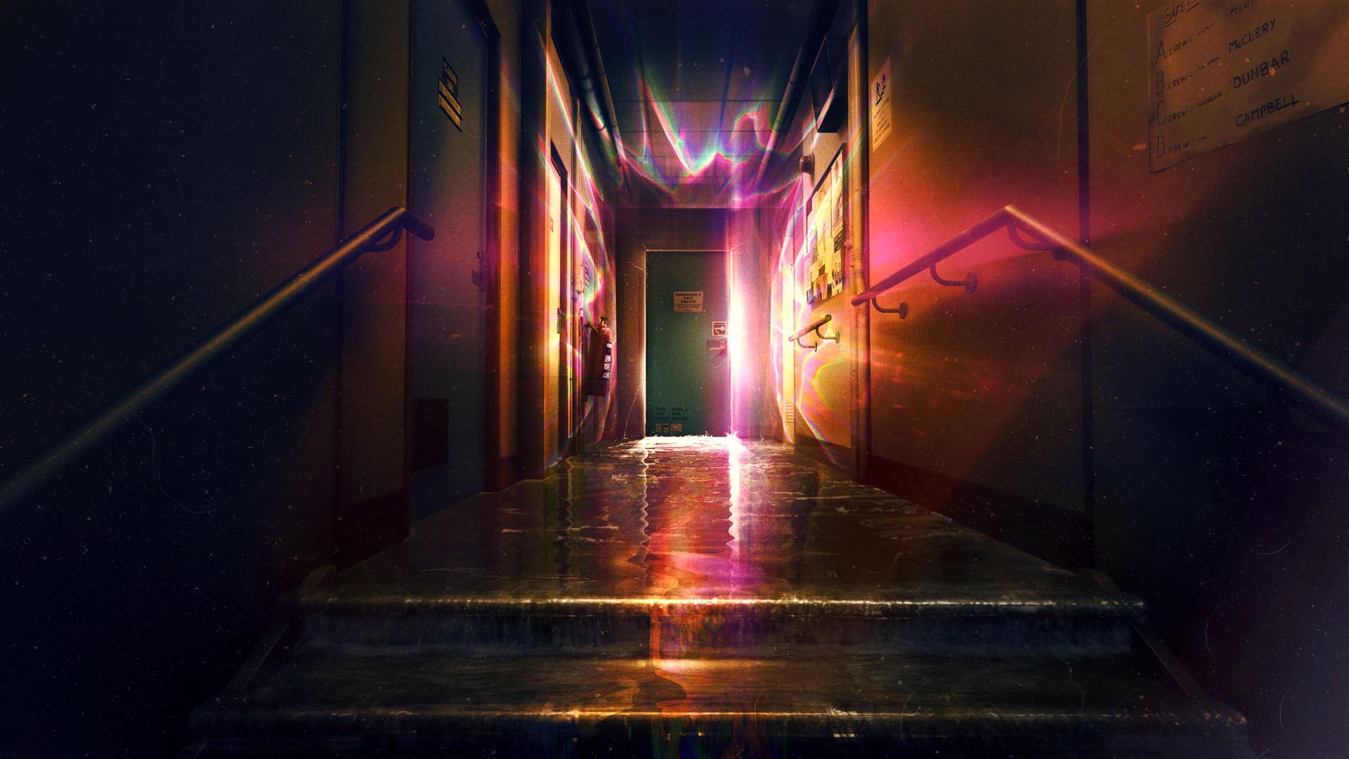
For Still Wakes the Deep we took inspiration from films of the ’70s where the mise-en-scène becomes increasingly psychological in its expression of terror and reality coming undone. Suspiria’s lighting was seminal particularly for its use of colour, mostly garish reds and vibrant blues, to create hypnotic and terrifying sequences. As the protagonist Suzie descends further into a nightmarish world, the set design and spaces in the dance academy start to take on a dream logic also. Flashes of this can be seen in Kubrick’s maze sequence in “The Shining” and, to a much larger extent, in “2001: A Space Odyssey”. Associate art director Laura Dodds (She/Her/Hers)


